Comparison infographic example · Leadership Feedback That Works
A sample infographic, made with InfographicHQ from the topic “Feedback that lands, and feedback that doesn't”.
Same layout, look and colours, on your topic. Your first one is free.
Open it full size to read it. Made with InfographicHQ, down to the words.
Why this comparison layout works
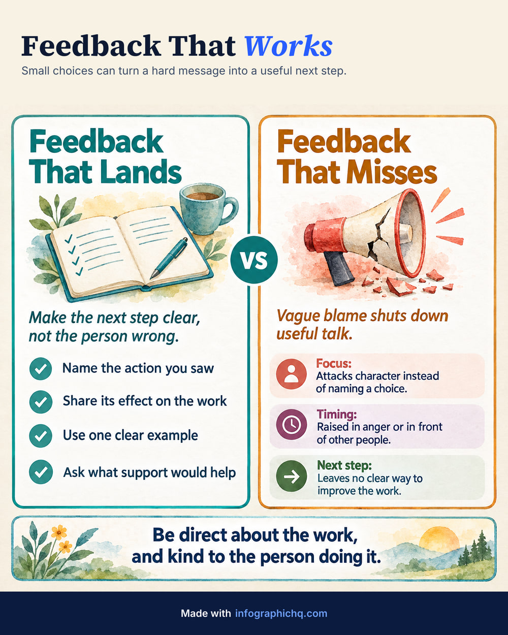
Here, the left panel is a checklist of four points and the right names three ways feedback misses: focus, timing and next step.
How this infographic was made
InfographicHQ made this comparison infographic from one typed topic.
Topic and style
- Topic typed
- Feedback that lands, and feedback that doesn't
- Layout
- Comparison
- Look
- Creative
- Pictures
- Watercolour
- Colours
- Cream
- Length
- Standard, 81 words
- Cards
- 2
- Shape
- Portrait 4:5
A comparison suits a point that is really about a difference: good habits against bad ones, before and after, one option against another. Matching rows on each side let the reader compare line by line, so give both sides the same labels.
The words in this infographic
InfographicHQ wrote these words from the topic alone.
Read the words
Feedback That Lands
Make the next step clear, not the person wrong.- Name the action you saw
- Share its effect on the work
- Use one clear example
- Ask what support would help
Feedback That Misses
Vague blame shuts down useful talk.- Focus:
- Attacks character instead of naming a choice.
- Timing:
- Raised in anger or in front of other people.
- Next step:
- Leaves no clear way to improve the work.
More infographic examples


Turn your topic into a finished infographic.
Get your free infographic
Yours to post on LinkedIn, with no watermark.
